Author Archives: airous
Project two Ideation
For this project I have come up with a hand full of ideas. The problem is I haven’t been able to decide which idea I want to go with. I want to get away from some of the ideas that where in my last project such as music, barbies, even the color scheme. I want this one to be completely different however my strongest idea once again come from music.
Concept 1- the idea of music telling a story through sound. This to me is beautiful in just the instruments. What a wooden guitar can do to someone and how it can make you feel.
Concept 2- the rights of women through the type of shoes they wear. Starting from the 1920’s idea of a high heel up to present day.How women are judged by the shoes they wear and how powerful shoes in a outfit of choice can be.
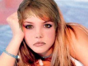
Concept 3- Beatuy in society can ben seen through someone’s eyes. It’s been the catchphrase of almost all romanitic novels and movies “I feel for you when I saw your eyes”. But even older eyes can be beatuful. Our eyes tell our story’s, what we have seen, weather we want them to or not.
Appropriated Images:
-decaying guitars, broken guitar strings, the wood of the tree that will be used to make a guitar. The different types of guitars.
-high heels from back in the day to present day, heels wore by powerful women in history.
-Different types of eyes starting from a babies eyes to aged eyes, different angels where maybe the top of the cheek from a person can be seen.
Line: The way the grid well be divide i was thinking of maybe like a comic book strip top to bottom. Instead of right to left. Also the lines of the images would matter for example if I whereto do the concept of music then the way a broken string would flow out of one image and maybe into another. I want to make sure no matter how I divide the grid up that the eye moves in the direction I want it to.
Color:
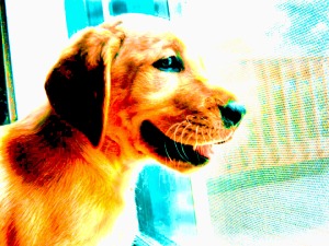
-A color for concept one that I would think about using is greens and reds to make the feel of music. Less reds though for I don’t want the piece to come of as anger. I would most likely pay with color manipulation like I did in the photo of my dog.
-For concept two I would use more color fixing than anything. To make sure that the bright colors where bright enough and made your eye want to look at them. I would want you to feel the power of the shoes and one single color might not work.
-Concept three I would use a monochromatic color scheme. My color of choice would be blue since blue is more of a relaxing color.
Shape: Of course since we are using a grid each picture will have to be in a square. But I was thinking of maybe bringing pictures so far close that you can only see one part of a picture or that they are so far back that maybe you can see someones face or shoulders as well.
Directional Force: For my grid I don’t want the directional force to be left to right as if you where reading a book. I want the force to make you go either top to bottom r right to left. This depends on the placement of the pictures.
Self Critique: Project one
Ashley Cafasso
Sarah Rockett
Studio Foundations: 4D
21 September, 2012
Self Critique: Project one
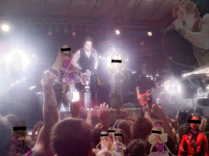
My first reaction to the art piece is that I did a really good job. It gives me the chills to look at it with the way the color scheme us laid out. A few adjectives that come to mind as I look at the work is, dark, kids, rock, concerts, perfection, and music. I think the work successfully communicates my idea with the use of Babies as the more “perfect person” in the piece and using censor bars to cover their eyes. I also like how there are a few imperfect Babies hidden from the audience. I think unsuccessfully the piece doesn’t communicate well type of stereotype I was trying to point out. The idea of a perfect person vs. a person who has tattoos or likes to listen to heavy metal. To those who will know the band in the background they might understand that stereotype, but to the general public there may be a little confusion.
The formal elements that I used helped communicate my idea because the Babies pose as the perfect, ideal person that kids look up to and want to be, where the lead singer of papa roach, Jacoby Shaddix is the complete opposite of perfect. He towers over the Babies s in the piece and is defiantly the center of imperfection. My work shows a social environment where stereotypes play a key role. It can lead into the thought of what parents what their children to be when they grow up. It also hits the nail on the head of how we show our kids what perfect is. The blonde Barbie being the main source and repeated in different formats from the princess Barbie, who was what I personally always looked up to, all the way to the rock star Barbie. The rock star Barbie sits right next to the rock star himself and poses which one a parent would more likely wish their child to be.
Project one brain strom
Environments
-Outside
-Social
-Streotypes
-Concerts
-“in” crowds
-cliques
-music influences.
Elements
-live music scene
-I want the picture to make it feel like your there, like you can hear the music and know what is going on even if you have never heard of the band before
-lyrics to help the mood of the piece
-the colors should make the audience feel excited and energetic,
-Papa roach as the band
-Stereotypes: rock, goth, “bad kids”
